
Going through the Material-UI drawer documentation, which in general is a great resource, I have decided to write a post to make it even easier for everyone wanting to implement the drawer.
In this post, I will show you in detail how you include a hamburger menu navigation that slides out from the side in your React web app. I also will explain how every line of code works and interacts. This lets you customize your drawer navigation even further.
First, I will go through the code bit by bit with a fully styled code example at the end of this page. As a prerequisite, you need to have a React web app set up and Material-UI installed.
1. The basic structure of the Material-UI Drawer
The example below is the basic structure of the drawer. Here it is enclosed within the navigation bar, shown by the tags <AppBar> and <Toolbar>.
First, you can see the <IconButton> which represents the actual hamburger menu icon. It has the onClick event that triggers the drawer to show up.
The sx property is new in Material-UI 5. It is a form of convenient inline JavaScript styling with access to the Material-UI Theme values. In this case, it is used to have some margin on the right side and to display the hamburger menu only on devices of the size “xs” (<600px). You can read more about the sx property in the Material-UI documentation.
<AppBar position="static">
<Toolbar>
{/* hamburger icon shows the drawer on click */}
<IconButton
edge="start"
color="inherit"
aria-label="open drawer"
onClick={toggleDrawer(true)}
sx={{ mr: 2, display: { xs: 'block', sm: 'none'} }}>
<MenuIcon />
</IconButton>
{/* The outside of the drawer */}
<Drawer
// from which side the drawer slides in
anchor="right"
//if and how easily the drawer can be closed
variant="temporary"
//if open is true, drawer is shown
open={open}
//function that is called when the drawer should close
onClose={toggleDrawer(false)}
//function that is called when the drawer should open
onOpen={toggleDrawer(true)}
>
<Box>
{/* The inside of the drawer */}
</Box>
</Drawer>
</Toolbar>
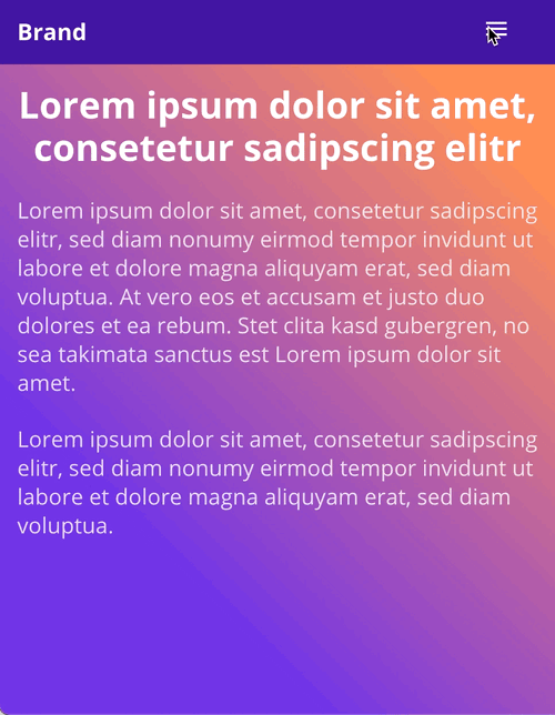
</AppBar>The next element is the actual drawer, the navigation that slides in from the side when clicking the hamburger icon. The drawer itself covers the full viewport as you can see in the screenshot below.
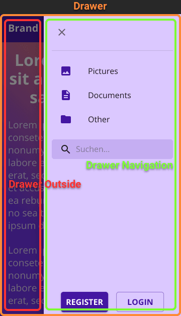
Drawer Properties
Within the <Drawer> tag you can set the properties.
-
anchor:
right,left,top,bottom
for the side of which the drawer should slide in -
variant:
permanent,persistent,temporary
if the drawer can be closed and how easily it can be closed, in this post I will focus on the temporary drawer that can be more easily closed -
open:
boolean
when open is true, the drawer is shown -
onClose:
function
callback function that closes the drawer -
onOpen:
function
callback function that opens the drawer
You can also style the background (Drawer Outside in the screenshot), which is by default a black transparent overlay.
Enclosed in the <Drawer> tags is the actual drawer navigation. Styling the <Box> will style the whole drawer navigation area. You place anything you would like to include in the navigation within this <Box>.
2. Logic behind the opening and closing of the drawer
We now have to wrap the code from above in a React function whereas the code from above should be in the return statement:
export function DrawerNavigation() {
    return(
        //code from above inside here
    );
}
At the beginning of the function (before the return statement) we need to declare a React useState, which we need to preserve the state of the drawer. If it would be a normal variable, the value of that variable would have been lost after the function got executed.
The useState looks like that, “open” as the variable, “setOpen” to change the value, and “false” as the initial value:
const [open, setOpen] = useState(false);We still need to define the callback Function after the useState. We could change the open variable straight away by calling setOpen from the <Drawer> Element.
However, we then would lose the ability to switch focus between elements with the Tab-key. To make that still possible we have to capture that event through following function. It does not change the state when the user hits Shift or Tab.
const toggleDrawer = (open) => (event) => {
  if (event.type === 'keydown'
    && (event.key === 'Tab' || event.key === 'Shift')
  ) {
    return;
  }
  setOpen(open);
};
3. Adding elements to the hamburger navigation
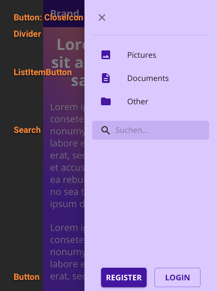
Now we should have a working hamburger navigation or drawer (do not forget the imports). The only thing that is missing are the elements within the drawer.
In my example, I have added a close button, some list elements, a search bar, and a register and login button. You can choose whatever fits your requirements. Here you can find the Icons provided by Material-UI.
Happy coding! ✌️
Full code example including some styling:
import React, { useState } from "react";
import { styled, alpha } from "@mui/material/styles";
import AppBar from "@mui/material/AppBar";
import Toolbar from "@mui/material/Toolbar";
import Typography from "@mui/material/Typography";
import IconButton from "@mui/material/IconButton";
import MenuIcon from "@mui/icons-material/Menu";
import Container from "@mui/material/Container";
import Box from "@mui/material/Box";

//drawer elements used
import Drawer from "@mui/material/Drawer";
import CloseIcon from "@mui/icons-material/Close";
import Divider from "@mui/material/Divider";
import ListItemButton from "@mui/material/ListItemButton";
import ListItemIcon from "@mui/material/ListItemIcon";
import ListItemText from "@mui/material/ListItemText";
import FolderIcon from "@mui/icons-material/Folder";
import ImageIcon from "@mui/icons-material/Image";
import DescriptionIcon from "@mui/icons-material/Description";
import InputBase from "@mui/material/InputBase";
import SearchIcon from "@mui/icons-material/Search";
import Button from "@mui/material/Button";

const StyledSearch = styled('div')(
  ({theme}) => ({
    position: 'relative',
    borderRadius: theme.shape.borderRadius,
    backgroundColor: alpha(theme.palette.primary.main, 0.15),
    '&:hover': {
      backgroundColor: alpha(theme.palette.primary.main, 0.25),
    },
    marginRight: theme.spacing(2),
    marginLeft: 0,
    width: '100%',
    [theme.breakpoints.up('sm')]: {
      marginLeft: theme.spacing(3),
      width: 'auto',
    },
  })
);

const SearchIconWrapper = styled('div')(
  ({ theme }) => ({
  padding: theme.spacing(0, 2),
  height: '100%',
  position: 'absolute',
  pointerEvents: 'none',
  display: 'flex',
  alignItems: 'center',
  justifyContent: 'center',
}));

const StyledInputBase = styled(InputBase)(
  ({ theme }) => ({
  color: 'inherit',
  '& .MuiInputBase-input': {
    padding: theme.spacing(1, 1, 1, 0),
    // vertical padding + font size from searchIcon
    paddingLeft: `calc(1em + ${theme.spacing(4)})`,
    transition: theme.transitions.create('width'),
    width: '100%',
    [theme.breakpoints.up('md')]: {
      width: '20ch',
    },
  },
}));

//search as JSX
const search = (
  <StyledSearch>
    <SearchIconWrapper>
      <SearchIcon />
    </SearchIconWrapper>
    <StyledInputBase
      placeholder="Suchen…"
      inputProps={{ 'aria-label': 'search' }}
    />
  </StyledSearch>
)

export default function MainNavigation() {
  /*
  react useState hook to save the current open/close state of the drawer,
  normally variables dissapear afte the function was executed
  */
  const [open, setOpen] = useState(false);

  /*
  function that is being called every time the drawer should open or close,
  the keys tab and shift are excluded so the user can focus between
  the elements with the keys
  */
  const toggleDrawer = (open) => (event) => {
    if (event.type === 'keydown'
      && (event.key === 'Tab' || event.key === 'Shift')
    ) {
      return;
    }
    //changes the function state according to the value of open
    setOpen(open);
  };

  return (
    <AppBar position="static">
      <Container maxWidth="lg" disableGutters="true">
        <Toolbar>

            <Typography variant="h6" sx={{flexGrow: 1, fontWeight: 700}}>
              Brand
            </Typography>

            <Box component="div" sx={{
              display: {
                xs: 'none',
                sm: 'block',
              }
            }}>
              {search}
            </Box>

            <IconButton
              edge="start"
              color="inherit"
              aria-label="open drawer"
              onClick={toggleDrawer(true)}
              sx={{
                mr: 2,
                display: {
                  xs: 'block',
                  sm: 'none',
                }
              }}
            >
              <MenuIcon />
            </IconButton>

            {/* The outside of the drawer */}
            <Drawer
              //from which side the drawer slides in
              anchor="right"
              //if open is true --> drawer is shown
              open={open}
              //function that is called when the drawer should close
              onClose={toggleDrawer(false)}
              //function that is called when the drawer should open
              onOpen={toggleDrawer(true)}
            >
                {/* The inside of the drawer */}
                <Box sx={{
                  p: 2,
                  height: 1,
                  backgroundColor: "#dbc8ff",
                }}>

                  {/*
                  when clicking the icon it calls the function toggleDrawer
                  and closes the drawer by setting the variable open to false
                  */}
                  <IconButton sx={{mb: 2}}>
                    <CloseIcon onClick={toggleDrawer(false)} />
                  </IconButton>

                  <Divider sx={{mb: 2}} />

                  <Box sx={{mb: 2}}>
                    <ListItemButton>
                      <ListItemIcon>
                        <ImageIcon sx={{color: "primary.main"}}/>
                      </ListItemIcon>
                      <ListItemText primary="Pictures" />
                    </ListItemButton>

                    <ListItemButton>
                      <ListItemIcon>
                        <DescriptionIcon sx={{color: "primary.main"}}/>
                      </ListItemIcon >
                      <ListItemText primary="Documents" />
                    </ListItemButton>

                    <ListItemButton>
                      <ListItemIcon>
                        <FolderIcon sx={{color: "primary.main"}} />
                      </ListItemIcon>
                      <ListItemText primary="Other" />
                    </ListItemButton>
                  </Box>

                  {search}

                  <Box sx={{
                    display: "flex",
                    justifyContent:"center",
                    position: "absolute",
                    bottom: "0",
                    left: "50%",
                    transform: "translate(-50%, 0)"}}
                  >
                    <Button variant="contained" sx={{m:1, width: .5}}>
                      Register
                    </Button>
                    <Button variant="outlined" sx={{m:1, width: .5}}>
                      Login
                    </Button>
                  </Box>
                </Box>

            </Drawer>

          </Toolbar>
      </Container>
    </AppBar>
  );
}